A strategic concept with a thematic structure, informing all colour, typography and material choices, the visitor is guided to intuitive understanding and a richer experience to this important subject.
Client: Etnografiska Museet/Museum of Ethnography, Stockholm
Design: Charlotte Ryberg (visual identity, exhibition scenography and graphics)
Human Nature was first set up at the Museum of World Culture in Gothenburg. When the exhibition came to Etnografiska, I was commissioned to create a new visual identity and a more communicative and functional scenography for the main part of the design – 9 physical structures highlighting different subthemes.
With a thematic approach I created a concept where a thematic colour scheme was the starting point, enabling the visitor to be guided more intuitively in the space and easier understand the vast material. I designed a bolder and simplified exhibition graphic, a sign strategy structured in different levels and manifested in shapes and materiality that would be relevant in this space. Reminding more of protest signs than nondiscript “kapa”-signs, suspended with wood bars and rope, the largest, the intro signs for the 9 cocoons, lashed to the ground by sandbags. All more human made than industrial.

A bold and minimalistic exhibition graphic. Bringing forward the juxtaposition between Human and Nature, Human Nature as well as Human as part of Nature.

For the Visual Identity I wanted to the two main parts make a bold impact when they are put against each other. No other distractions. Just human vs. Nature. Human AND Nature.
A cohesive colour scheme, used in different variations throughout the thematic cocoon structures, highlighting different subjects.


With thematic colours, each story is clearly distinguished. And everything (object, signs etc) coherent and focused.

Detail. Exhibition entry.
Large scale floor typography leading the way in to each thematic cocoon.

A cohesive colour scheme, used in different variations throughout the various structures, highlighting different subjects.

The floor typography guide you in to the nine thematic cocoon structures.
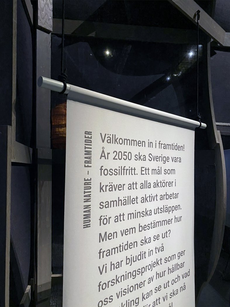

Detail of the hanging signs.
The thematic concept, where colour are used in a strategic way to invite the visitor into different stories within the overall concept. Each story or focus has a colour, saturating furniture, display system and signs. Different materials, same colour.
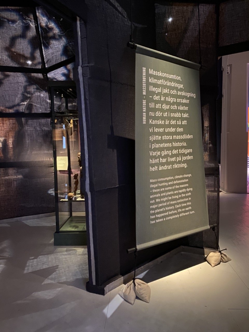
Reminding more of human made protest signs than nondiscript industrial “kapa”-signs, suspended with wood bars and rope, some lashed to the ground by sandbags. Highlighting that there are humans both responsible for, but even more so affected by climate change and fighting for a better relationship between human and nature.

The exhibition title on floor.