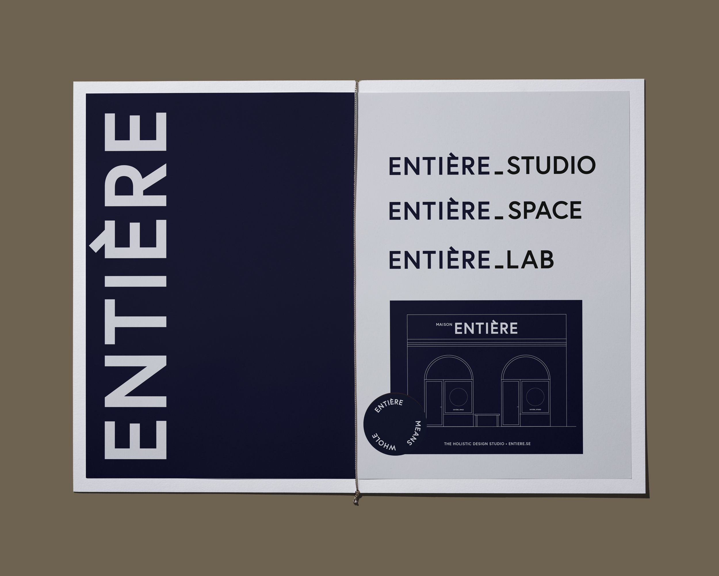
The studio’s own visual branding. Straightforward, simple and fun to use.
Client: Entière
Creative Direction & Design: Charlotte Ryberg
Photo: Ea Czyz
For our own visual identity, we wanted to keep it really straightforward, focusing on clarity on the name (it’s complicated enough with it’s French pronounciation, right?)
Three colours: a creamy white, a dark, dark navy, and an earthy, warm but toned down brown.
Three name combinations: Entière Studio, Entière Space and Entière Lab.
A couple of typo-play-ideas and creative quirks – with the words Entière means whole, and with the È (an E with a grave accent) into two almost figurelike combinations, which also turns into a pattern.
All and all just an easy to use identity for use digitally on social media, webb, and physically on product packaging etc.
In addition to that, our brand images bring it all to life in a personal way.
A collection of curated brand images. Photo Ea Czyz.
Poster with the studios “Ten Principles of Holistic Design”
Hang tag for our Artisan Collection Les Objet. High end, small scale production of objects for a Creative Lifestyle. Topped with a sticker “Entière means whole”.
Packaging showcasing the use of the È (E with a grave accent) as a playfull pattern. Subtle or bold.
Minimalistic business card in two colourways.
The studios main logo and three extended versions of the logo. Illustration inviting to “Maison Entière” (play with words, referencing traditional fashion “Maisons”, but basically meaning “the whole house”).
Brand garments. Here a boiler suit with playful graphics figures from the È (with a grave accent) for the experimental work we do in Entière LAB. A reminder that you can do really creative endeavours with simple things.


