Manifest Aesthetically
When inviting to the usefulness of your objects and spaces, do it in an aesthetically inspiring way!
How to manifest our visions and values with impactful and considerate design qualities?
“Don’t make something unless it is both necessary and useful; but if it is both necessary and useful, don’t hesitate to make it beautiful.”
One might read this classic expression, a shaker design philosophy, in a way that function is the most important thing and that aesthetics is something good we can, and preferably should add on top.
But it also shows the absolute correlation between the what and the how, the usefulness and the aesthetics. They are both fundamentally human, and together they make our places and objects useful for us, in all the dimensions of being human. Mere functions are simply not enough for fully human experiences.
The bigger part of our surroundings are at this stage in time designed by us humans, even those we percieve as “nature” and that percent only increases. That’s why it’s essential to really be very conscious and take care of our surrounding, in making it work for us, but also always with thoughtful and dedicated aesthetics.
In this 4th issue, we dive into aesthetics.
It’s time for Principle No.3 “Manifest Aesthetically”.

Ten years ago in Tokyo, me and my husband visited an atelier practising traditional laquer skills, but with a contemporary expression. We bought two boxes, one black and white with dots, and one with gold leaf. I will always cherish them and they carry a daily reminder of the whole wonderful trip. In this space, the aesthetic considerations ran through the whole experience.
And I happened to be very well adapted to the environment, which is an important reminder to understand and be curious how your audience perceive your brand and can engage in your story. Who are you talking to? Which aesthetic language do you use when in dialogue?

To develop your aesthetic sensiblitity and skills, I’ve found that these three parts are fundamental. I also teach these to my design students (I have 12+ years experience of teaching design, and I love it.)
TO SEE. Practise noticing, discovering, feeling the beauty and abundance around you.
TO COLLECT. Be a hunter gatherer for things that intrigue you. Your whole collection tells you something.
TO DO. Experiment. Create. Develop through seeing what actually comes out when you create.
The aesthetic qualities we consider in the creative process.
An aesthetic practise is a work with many layers. As an identity and interior design studio we walk our way through these and more when creating considerate objects and spaces.
Define with Shapes.
We structure and give personality with different forms. Square or circular, soft or hard, pointy or fluffy? An intricate combination? It’s designing the parts, but also the whole. Combine, deconstruct…But it also considers movement, creating flow.
Express with Colour.
Colour is, just as music, highly intuitive and reaches us immediately, evoking emotions. It affects the way we feel, but also act and make choices. Hardly anything talks to us more directly than the colour choices of an object or a space.
Still it’s an underused strategic tool, maybe because colour choices are a quite complex endeavor that demands practised sensibility and a lot of knowledge and skills to be used properly and effectively.
Ground with Materiality.
The shape and colour choices are deeply linked to the material qualities. A rough material feels completely different than a sleek, glossy, even though they’re given the exact same colour or shape. We need to consider materiality as an integrated part.
Materiality also enable tactility, comfort, expression of character. This is even more important to consider now, when so much of our experience is digital.
Speak through Typography.
You speak with words. And typography is the shapes of word. Your audience “hear” you through the tonality of typography. Spatial and graphic qualities are linked and when we create, there can be synergies. To us this is so important.
Spatial and graphic design are not two separate entities, they are experienced together. This has long been one of the aspects we work with to deliver seamless spatial brand experiences and exhibitions.
Come to life with Images.
How we chose and create the images for brand spaces and spatial experience, is equally important. It’s a language too. The qualities above are all integrated here. And it is a strong player in setting up the next one as well..
Appear through Tonality.
Tonality is the overall atmosphere that all of the above will give. Is the red colour you’ve chosen a warm, loving one, or a fast and furious, dangerous one? Are the circular shapes appearing modernistic or bubbly and playful?
But above all, do all of your aesthetic choices appear to your audience in the way you like it and need it to?
In addition to these, there’s qualities like….
….rythm, symmetry/assymmetry, repetition, light and shadow….
hmm….aesthetics is surely not just a superficial thing.

Close-up a bespoke Sequence Screen. Materials, colours, shape, intertwined. The process of how we thread by thread, layer by layer, create it, and make it bespoke through a painted addition.
Aesthetics is not just the finished result. It is also a how. The way it is made. The way we use it.
As an atelier design practise, we also include the process, how things are made, in these aesthetic qualities.
Just as with the separation of mind and body, we lost this synergetic relationship somewhere along the line as a side effect of industrialization of producing furniture and objects.
But consider this.
Just as in nature, where a flower not only looks beautiful when in bloom, but also developes and opens up in an exquisite way. Or how a japanese master prepare and cook a meal and how it is also a part of the experience and the gratefulness of the moment. Or how the indigo colour of a perfect pair of denims gets added depth when knowing they’ve gone through a real indigo dye colour treatment from seed through harvest, from several dips in the indigo vat to your favourite pair of well worn clothing. And Jackson Pollocks painting wouldn’t be as inspiring if you had just seen his paintings, and never the way he painted expressively. It’s like the saying “how you do anything, is how you do everything”.
Shoutout to other fellow creatives that I work alongside, that are all trying to find ways to connect to owning the process of creating and making again: Greening, Wildcrafted, Lisa Hilland, Marcia Harvey Isaksson, and many more.

Colour inspiration.
Browns and steely, almost blue. Shiny and matt. Light and dark nuances. This image will be included in the material board for next week’s #mondaymoodboard as it ties together browns and steely blue tones. Photo: Charlotte Ryberg
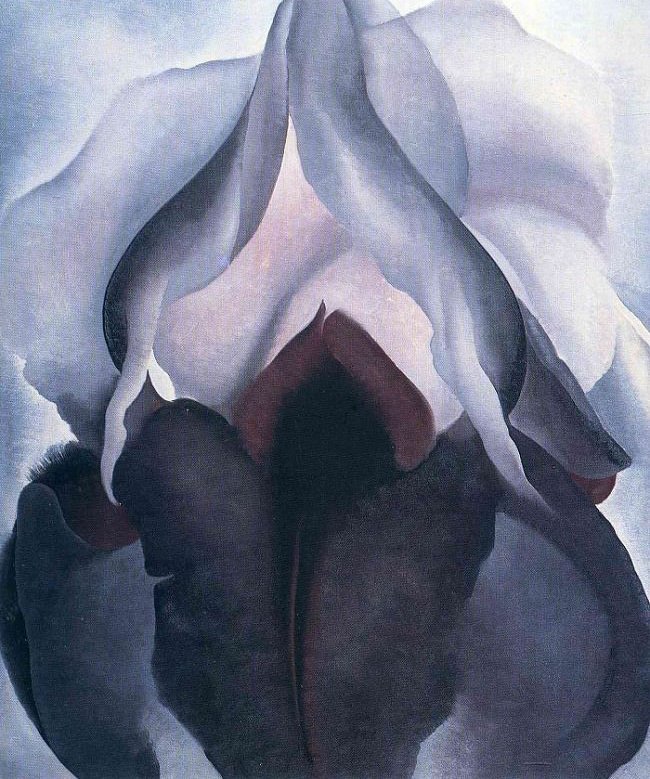
Black Iris
Painted in 1926, by Georgia O’Keeffe, who payed close attention to notice the abundance and beauty in nature, and through her dedicated, large scaled work, she reminded us about it.
